BACK TO MY WORKS
Movie Ticketing App
Concept design of a movie ticketing app for a movie theater
Overview
Movieland is a movie ticketing app for the Movieland movie theatre. It allows customers book tickets in advance for their favourite movies.
Problem Statement
Busy people mostly don’t have the time to go to the movie theater and wait in line to book tickets in advance.
There are also people who use visual aids to enjoy movies but find it difficult because they cannot choose an appropriate seating area.
Goal
Let users pay movie tickets online in advance and choose their preferred seating area which will affect busy people and those with visual aids so that they can save time and enjoy their movies.
User research
I conducted a competitive audit, observing how other movie theaters handle the ticket booking process and how efficient it was. I initially assumed that theaters allowed advanced booking and discovered that only select theaters do that.
However, most theaters do not provide access to preferred seats for movie goers with who use visual aids. This changed how I perceived the users’ needs in terms of accessibility.
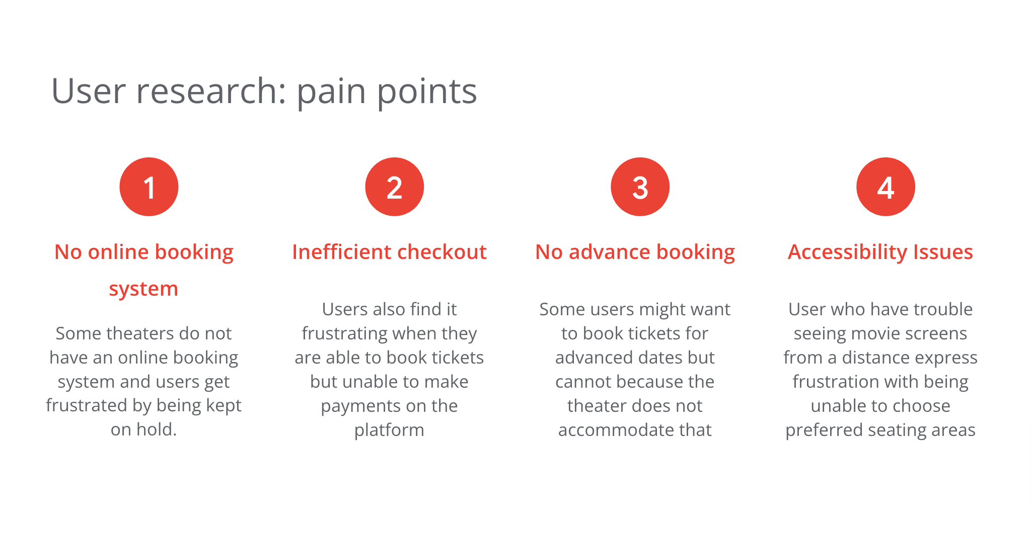
Pain Points
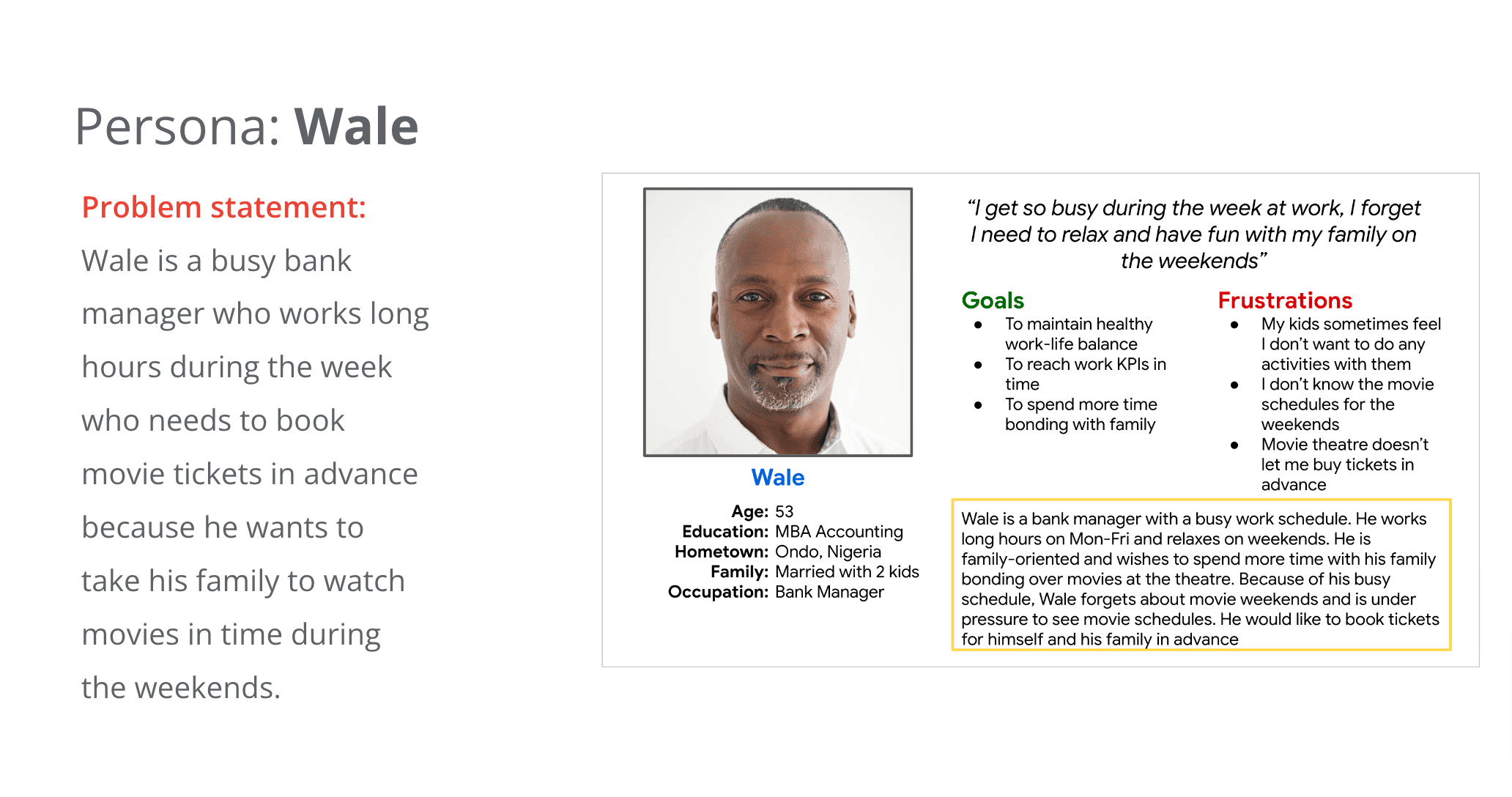
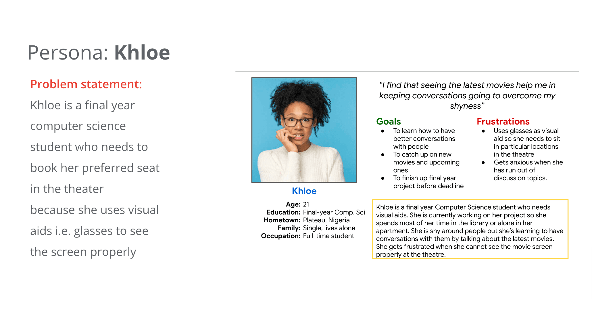
User Personas
User Journey Map
This is the user journey map for Wale whose goal is to have an efficient way to book movie tickets in advance. I had to think through what the actions he would take in this scenario and the emotions he would feel while doing them.
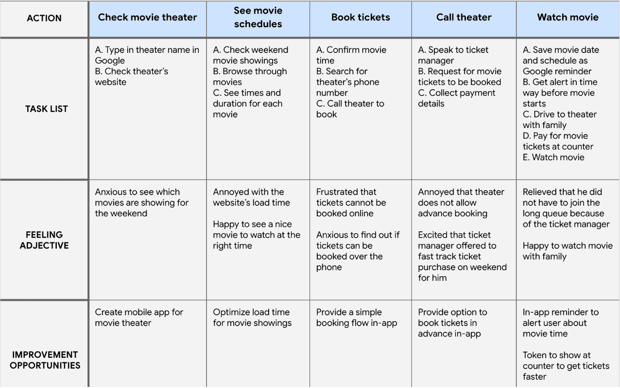
User Journey Map for one persona
Paper wireframes
These are the wireframes I sketched out to bring out my ideas and thoughts. In these layouts, I was thinking about how to get the user to browse through movie dates and schedules first.
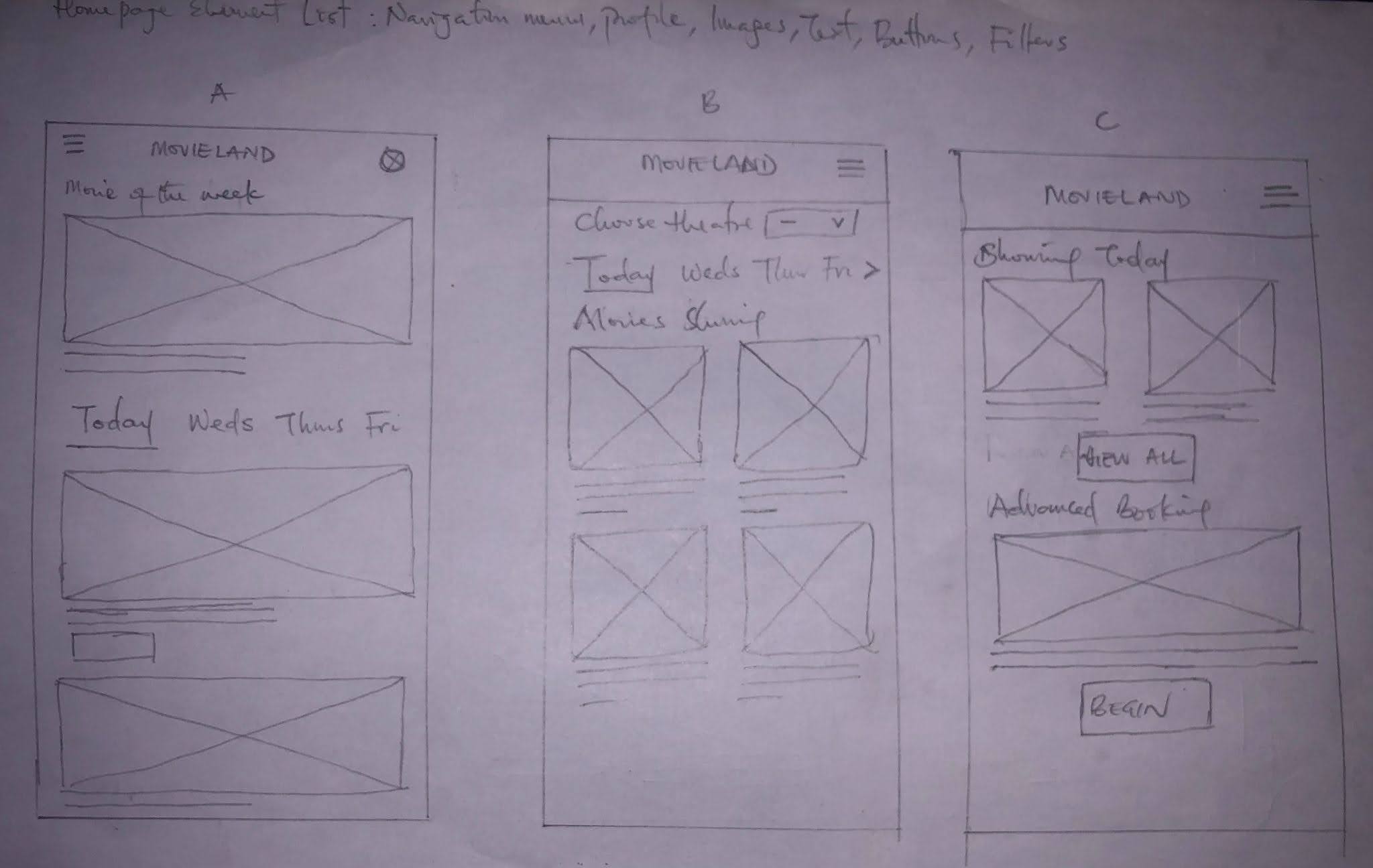
Wireframe sketches during ideation
In these versions, I took another approach. This time, I made a Book Ticket button stand out so that users can take action from the home screen
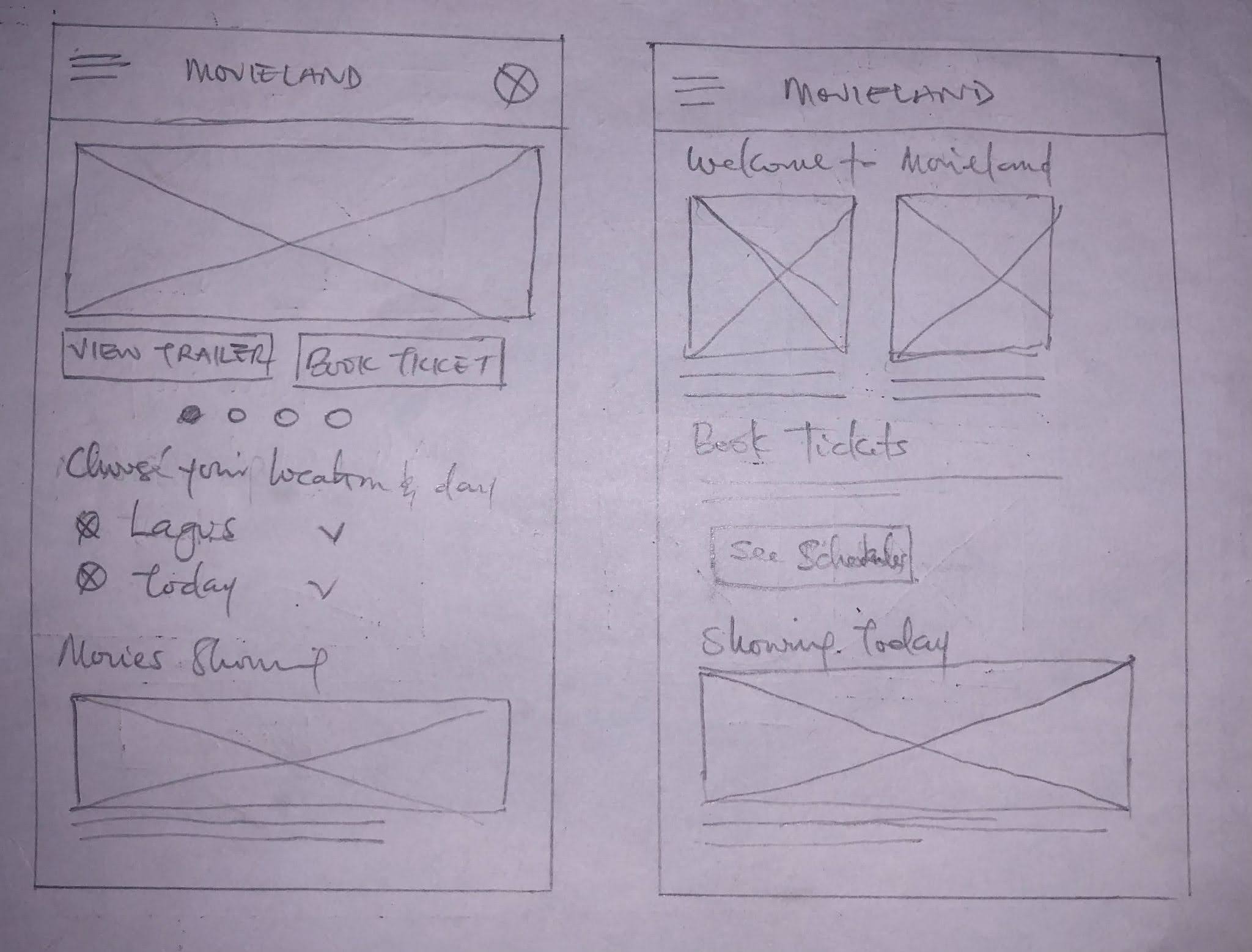
Wireframe sketches during 2nd ideation
Digital wireframes
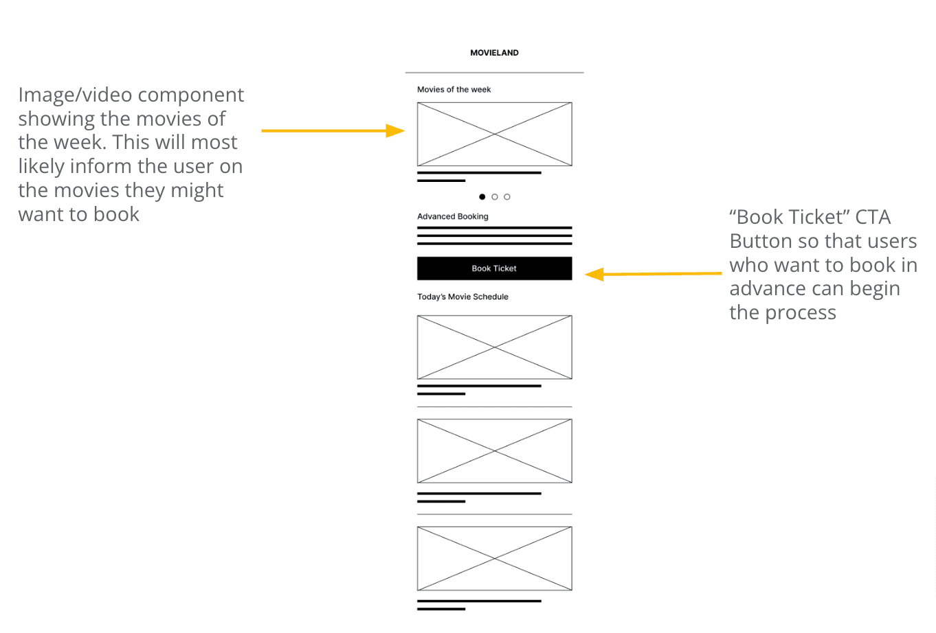
On the home screen, users will want to see what movies are showing before they book tickets. For users who already know what movies they would like to see, a CTA button is available for them to click and begin the booking process.
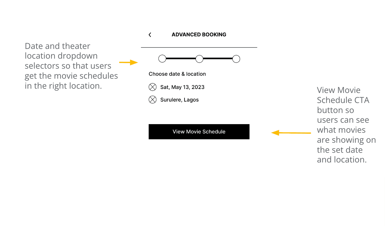
The booking process begins with choosing the advance date and movie theater location. That way users get the accurate movie schedules for their preferred theater.
Low-fidelity prototype
I made a low-fidelity prototype to get a feel for the app's flow and got some insights from this process.
Low Fidelity Prototype
Usability Study: Findings
The goal of this usability study is to find out if the main booking and checkout experiences will be easy for users to perform.
Round 1 findings
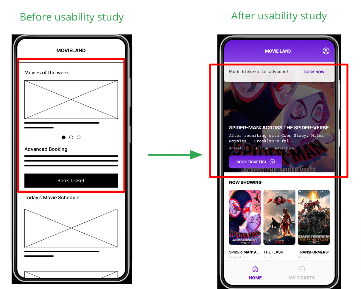
Users need better cues to find movies for any day of the week.
Provide a well detailed seating arrangement of the theater and show which seats are available.
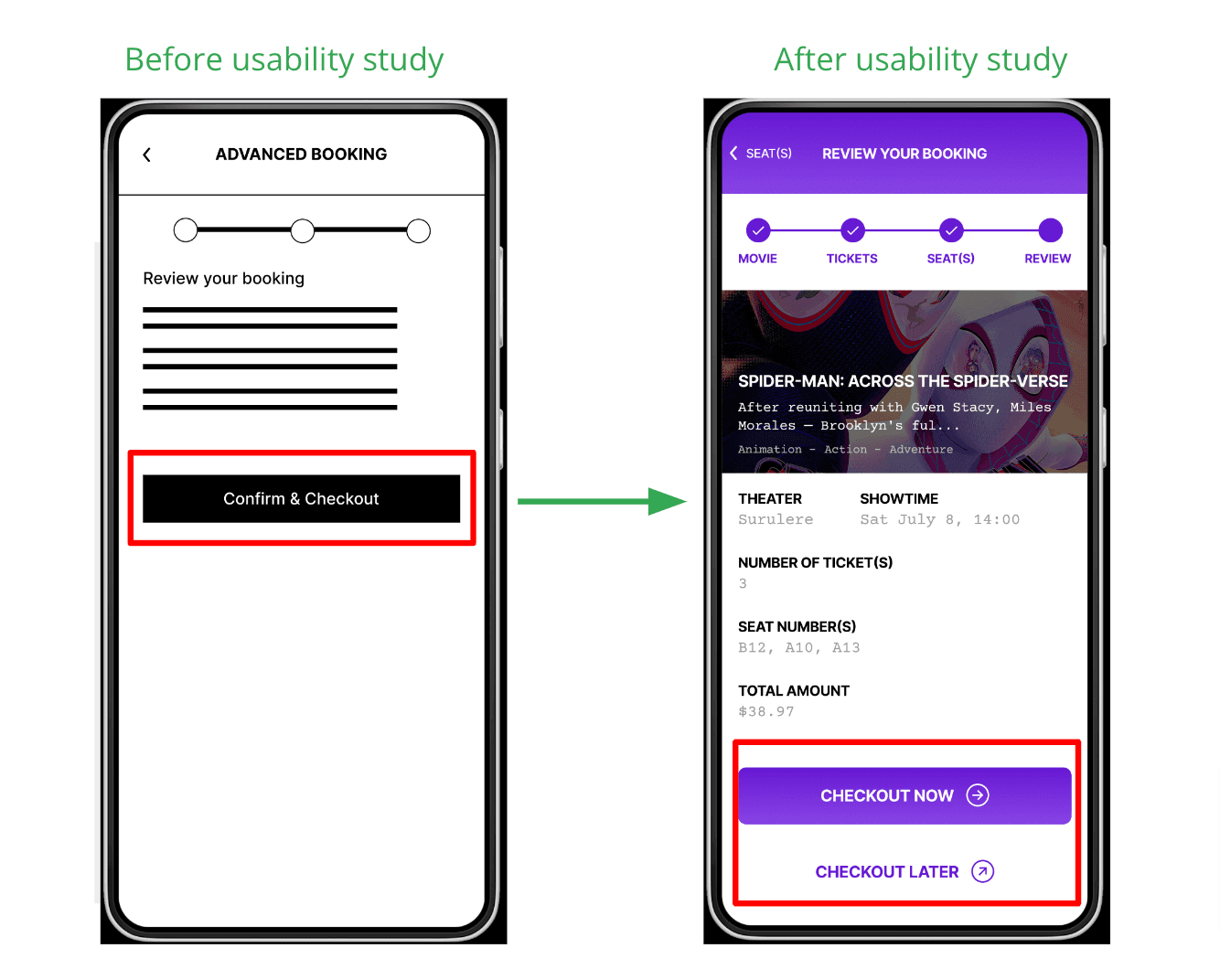
Provide better cues to know that their progress will be saved if they don’t complete the booking process before checkout.
Round 2 findings
Users need to easily access their tickets after booking
Users need to easily view movie details and book from their if they want to.
Users need to keep track of their ticket purchase history.
Mockups
I thought about how users can easily preview movies showing and take action to book in advance. Having different CTA buttons helped in guiding them to book tickets from the home screen quickly.
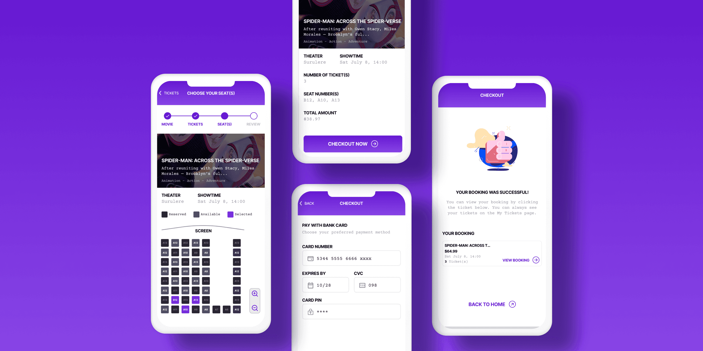
I also gave users the option to checkout immediately or later. They will be able to access their bookings in the My Tickets section of the app.
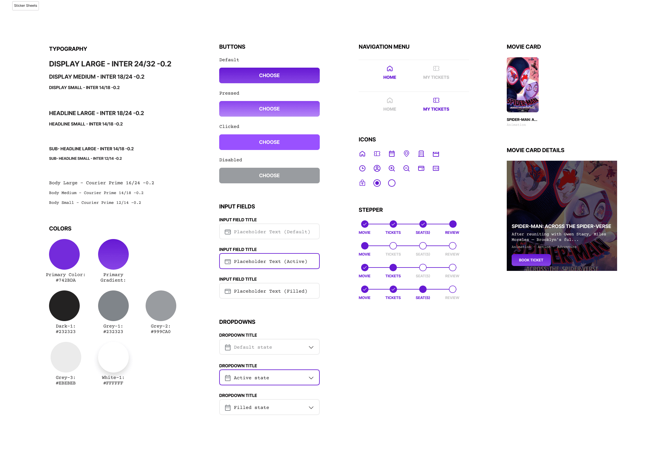
Sticker Sheet
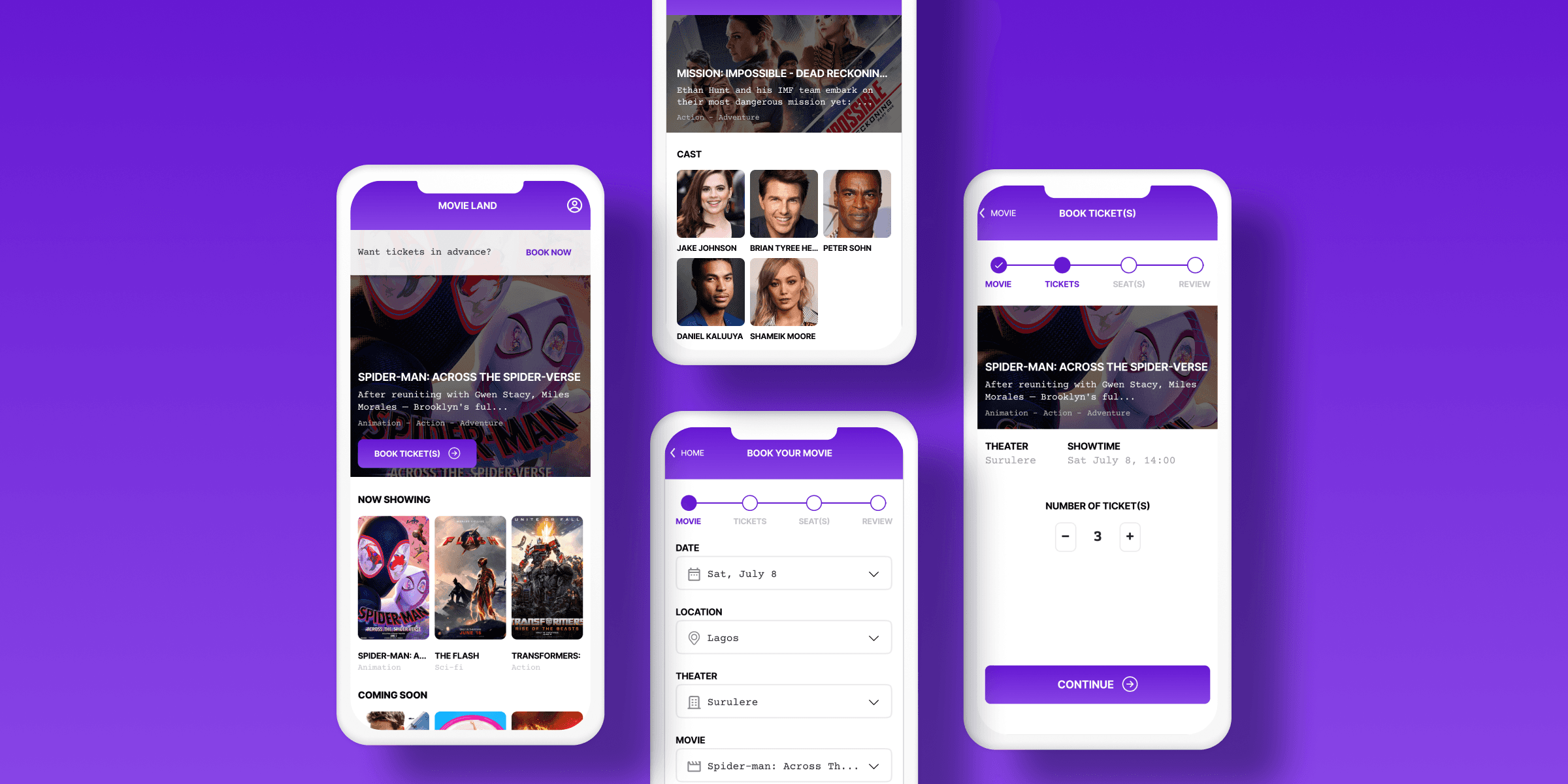
High-fidelity Prototype
Accessibility Considerations
Users who have readability issues have been provided with a zoom feature to be able to pick appropriate seats
The use of appropriate iconography have helped some users who struggle to read text on screens understand each feature and simplify their experience.
The app is designed to minimalist color palette so that it is aesthetically balanced and easy on the eyes.
Takeaways
The app solves a major issue for busy people who don’t have time to wait before they are at the theater before they can book movie tickets.
One user I tested the idea with stated:
“I like that I can even see the tickets I’ve gotten. It makes me feel like I’m spending my time in the right way”
I also learnt about considering user behaviour and the different instances in which users will be experiencing a product.
Future Considerations
Conduct another round of usability tests with the focus on different payment methods since some people might want to explore those options.
Explore edge cases for the app i.e. negative scenarios so that we account for them during use.
Explore the onboarding process to the app and user profiles.
BACK TO MY WORKS
